To take survey please click here:
https://www.surveymonkey.com/s/QVQ9LTR
I designed a survey on SurveyMonkey to get feedback on my magazine. I asked set of questions which cover all aspects of my magazine including the colour, layout and font of each page. I included some open and closed questions in order to get a variety of responses. The open questions will produce qualitative data which ensures that I will get detailed responses to help me improve my magazine.
Saturday, 28 December 2013
Friday, 27 December 2013
Chosen Images
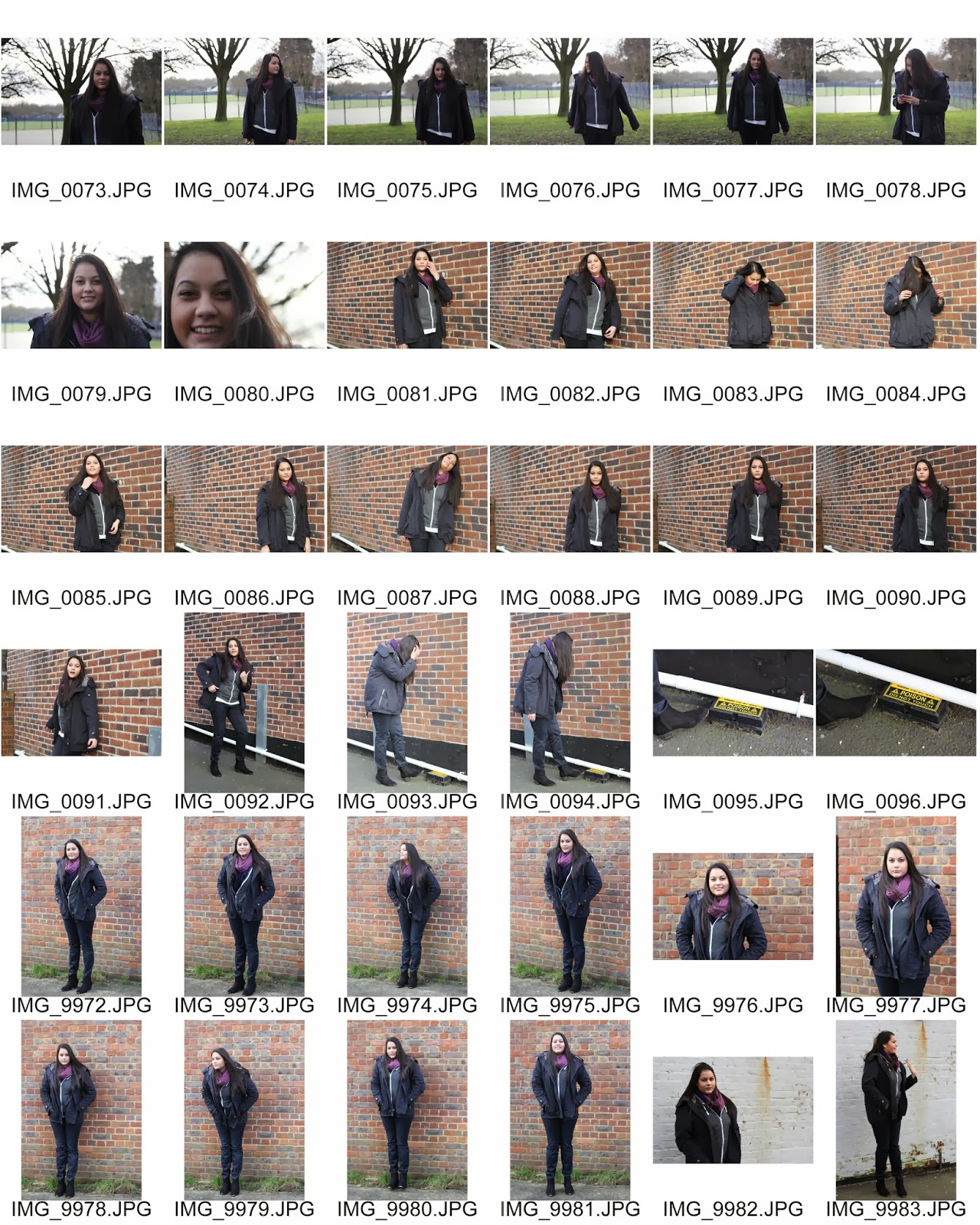
I picked out some of the photos from all of the photos I took in the photoshoot which I thought were good and I would possibly use in my magazine. I chose some which I thought would be suitable for the front cover and also chose some other interesting ones for the double page spread. I also selected some which I thought would be appropriate for the contents page.


I did the same thing for my outdoor shoot, picking some photos which I thought is suitable to use in my magazine. I picked 11 photos from the 124 photos I took.
FINAL CHOSEN IMAGES: I then further cut it down and ended up with a total of 8 images which I used in my magazine for the front cover, contents page and double page spreads.
Photoshoot Behind The Scenes
When I did my studio photoshoot, I used my phone to take some images and videos for the behind-the-scenes.
I then transferred these onto the computer and selected the images and videos I wanted to use. I created this short clip on Windows Movie Maker. I found it very easy to use but produces a video which looks good such as the transitions and effects.
As my magazine is based on the pop-rock music genre, I decided to use an instrumental version of Avril Lavigne's Smile for the background music. Even though it is an instrumental, it still has strong features of pop-rock music with the guitar and drums used in the track and so I thought it would be suitable.
Contact Sheet
I took some photos outside for my magazine. In this outdoor shoot I took a total of 124 photos of my model Geeta. I then made a contact sheet using Photoshop.


Tuesday, 24 December 2013
Production Diary 16 - Evaluation, audience feedback survey and processes
24th December 2013
In the Christmas
holidays I finished the rest of the evaluation I draft form. I did questions 1,
2, 5, 6 and 7 as I did questions 3 and 4 already for homework before. In order
to answer these questions I had to constantly refer to my magazine and also
look back at some of my work on my blog about the audience.
I also
created a survey on SurveyMonkey to get feedback from my audience for my
magazine. I created a variety of questions, some with options for the respondents
to choose from and some where they had to type in their own answer. This made
sure that I had both quantitative and qualitative data.
Another
thing I did was the processes; this is where we had to show what we did before
and after as well as showing how we did certain things. For example I showed
the different stages of my work from the sketches to the actual product on In
Design. I also created short videos which demonstrated how I did certain things
for my magazine such as the drop cap and paragraph rule.
Thursday, 19 December 2013
Tuesday, 17 December 2013
Production Diary 15 - Finishing front cover for final draft
16th and 17th December 2013
I made several changes to my front cover. Firstly the biggest change I made was I added in the front cover image which fills the background. I then changed the style of the 'top 20 downloads of the month' sell line and also changed the one in the banner. I also added in the name of my magazine and changed it to the colour teal to match the rest of the magazine. I also changed the echo awards sell line so that it was all in black as I though it would look better for my magazine.

Tuesday, 10 December 2013
Production Diary 14 - Continuing to work on front cover and chosen images
10th December 2013
After doing the photoshoot, I had several images that I had taken. I started selecting the images I like and perhaps would use in my magazine. I made a folder to keep all these images together so I could make a contact sheet. After I had chosen all the images, I made a contact sheet on Photoshop. I divided it up so I had two 36-image sheets.
I continued to work on my front cover. I started to change the colours of it with the colour teal I decided to have as my main colour. I made the circle of the plug, the quote for the main sell line and some words of other sell lines the colour teal. This made a consistent colour scheme of teal and black. I also added other details such as the barcode, date and issue number.
Next week I will carry on doing my front cover and put in the images I had taken to test out which ones look good for my front cover.

Model release


In order to take photos of my models and use the photos in my magazine I had to get their consent through a model release form. This form clearly states the conditions they have to agree to in order for me to take and use photos of them for my magazine and they had to sign it to confirm that they allow me to do this.
Tuesday, 3 December 2013
Production Diary 13 - Creating the front cover, photoshoot and behind the scenes and starting evaluation
3rd December 2013
This week I started creating the front cover of my magazine.
I first put in all the sell lines I had come up with before. I altered the size, font and colour for some of them. I chose to use different two fonts for the sell lines so that it doesn’t seem too diverse. I used a different font for the main sell line so that it is clear that it’s the main article. I also added in the name of the artist that is on the front cover which is Ava. I made the size of this text relatively large so that the readers know the name of the artist is Ava. I downloaded some new fonts and added it into the set of fonts in NexuxFont. I made the font of ‘Ava’ a handwriting type of font and also added in a star next to it which indicates that her music is pop related.
I first put in all the sell lines I had come up with before. I altered the size, font and colour for some of them. I chose to use different two fonts for the sell lines so that it doesn’t seem too diverse. I used a different font for the main sell line so that it is clear that it’s the main article. I also added in the name of the artist that is on the front cover which is Ava. I made the size of this text relatively large so that the readers know the name of the artist is Ava. I downloaded some new fonts and added it into the set of fonts in NexuxFont. I made the font of ‘Ava’ a handwriting type of font and also added in a star next to it which indicates that her music is pop related.
For homework I started to work on the evaluation. I first off wrote about the distribution of my magazine. I talked about the institution which may distribute my magazine (IPC Media) and why I think it is suitable as well as why they may choose to distribute my magazine.
I also did the photoshoot on Friday 6th December. I took 465 photos in total with two models –one for the front cover and another for the contents page. I took a variety of shots mainly including close ups and mid shots so I can use it for the main image on the front cover. I also used different props such as a microphone and bubbles to demonstrate the music genre of the artist.
In addition to the photos I took for my magazine I also took some photos and short videos on my phone for behind the scenes.
Next week I will select the photos I want to use for my magazine. I will make a contact sheet to display all the photos I took. I will also start to create and edit the behind the scenes video.
Sunday, 1 December 2013
Tuesday, 26 November 2013
Production Diary 12 - Creating the contents page and equipment task
25th and 26th November 2013
(25th)

(26th)

This week I started actually putting in the information in my contents page. I first typed in the different subheadings of on the cover, features and regulars. I then pasted in the contents list I had made previously. I changed the size of it and adjusted the line spacing to a suitable number so that it was organised. I also changed the colour of the numbers to teal which I decided to use as the main colour for the colour scheme of my magazine.
I also pasted in the artist index and subscription box text. I changed some of the positions of the boxes around so that things fitted nicely on the page. I put the social media box on the left page and moved the subscription box to the left side of the right page so I could put the artist index on the right side of the right page. I placed in images of the Facebook, Twitter and YouTube logo in the social media box. I resized them so that they were all the same size and then positioned them in line with each other.
I decided some of the things I wanted to be shown with an image. I altered the position of the numbers on the images and added in a short description of the image.
I also added in paragraph rules to the subheading to make it look more interesting. I chose to have one line under the text which is teal (the main colour of my colour scheme).
For homework I did the task on equipment. For this task we had to write about the equipment we will use to create out magazine which include both software and hardware. For software, I wrote about using Adobe In Design and Photoshop and for hardware, I mentioned camera, lights and tripod. I presented this information on Prezi.
Monday, 25 November 2013
Tuesday, 19 November 2013
Production Diary 11 - Creating the layout of the front cover
19th November 2013
As I planned, this week I did the front cover layout. I first did the masthead, then banner and finally the sell lines and other features.
I drew a long thing black box for the banner which I placed at the bottom of the page. I then added in white text over it. This would be an interesting feature which readers would be attracted by.
I then added in the sell lines. I made a variation sell lines; I changed the look of each sell line with different sizes and fonts that I thought would be suitable. For one I had a black box behind the white text to make it stand out from the other sell lines. For another one, I made the number in the sell line much bigger than the text which was also for emphasis. For the main sell line I made it much bigger in size and also a different style of the font I used for other sell lines so that it is bolder and eye-catching.
Another thing I added was a plug. I drew a black circle and then put white text over it. I placed this on the right side which is opposite the sell line with the black box behind it as I want to make a balance of different sell lines on the front cover. This would have competitions or freebies information on it.
I also added in other features such as the barcode, price, issue number and date. I represented these with a black outlined box.

Monday, 18 November 2013
Front Cover Layout

Afterwards, I created the bottom banner by drawing a black box. I then put white text over it. This will be where I put a feature that will likely be interesting to the readers.
I added in textboxes with a black border to represent the barcode, price and issue number and the date.
For some of the sell lines I used drew a black box behind each line to make it stand out and look different to the rest of the sell lines. I tilted the top and bottom box as well as this makes it disorientated and look more interesting.
On another sell line I made the number in between the two lines much bigger as this can really draw people's attention. I also changed the line spacing between the lines to make it more compressed together and look like they belonged together.
For the main sell line I used a variation of the font I used for most sell lines which was a 'linocut'. This made the edge of the text more rough and messy which makes it convey a pop/rock effect. In addition to this font variation, the greater font size, made it the next most eye-catching thing after the mast head.
I used a total of two different fonts and created variations of them to make it look more interesting that having the same font all over it. These variations included bold and linocut. In addition I made some of the sell lines in capitals to make it stand out and also indicate that it is the more important part of the sell line.
Thursday, 14 November 2013
Double Page Spread Layout

I first drew out the large black box on the right hand side as I knew that I wanted to have a full bleed image on the right hand side. I then drew out another black box on the left hand side of the double page spread. I initially drew one big box but then later decided to have several boxes because I thought that having several images would look better.
I then added in the heading and subheading at the top of the left page. For the heading, I changed the font to one that I had previously downloaded which is called 'Fake Smiths'. I used a very similar font for the subheading called 'Lazy sunday' so that it matches with the heading but is not entirely the same so that it distinguishes the difference between the two -making the heading stand out more than the subheading as I believe the font is bolder and more eye-catching.
For the main text I drew in text boxes in the columns and filled in placeholder text to represent the text in the article I will have. I made the first paragraph one font size bigger than the rest of the text and also made it bold so that it stands out. In addition, I made the first letter of the paragraph a drop cap 3 lines down; this made the first letter bigger in size which drops down to the 3rd line of text.
After I added in a pull quote in the 3rd column of text. I made the size of the pull quote relatively larger than the text in the article so that it stands out and draws the reader's attention I changed the font to the same font as the one I used for the heading so that it stands out from the article text. I also added in paragraph rules above and below the text. This made a sort of border without the side lines around the pull quote.
The website for my magazine is placed in the same position as it was with my contents page because I placed this on the A-Master page which means it will be in the same position for every page.
Tuesday, 12 November 2013
Production Diary 10 - Creating the layout of the double page spread and article text
12th November 2013
I finished doing the contents page layout and started on the double page spread layout this week.
I first drew in the black boxes to represent the images like I did for the contents page.
I then added in text for the heading, subheading and the article text I changed the font for the heading and subheading which were different but similar fonts so that they linked but puts emphasis on the heading because it is more bold and eye-catching.
For the article font I made it a different font so that it was more suitable to read as it is much clearer than the font I used for the heading for example as it is slightly disorientated which would make it hard to read.
I also then added in a pull quote in the same font as the heading and subheading so that it stood out but also followed the general style of the article. I made the font size much bigger than the rest of the article text as it needed to stand out to get the reader’s attention. To make it more interesting, I added in paragraph rules which I had been taught. This created two lines above and below the pull quote which makes it look quite impressive compared to just having enlarged text in a different font.
For homework, I did the article text. I first looked at existing articles and got inspiration from it to write my own. I wrote about 1,500 words for the article. I made my article quite informative as my front cover artist is new and so the readers are unlikely to know much about her.
I plan to do the final layout of the front cover next week.

Monday, 11 November 2013
Contents Page Layout

I found an example of an existing contents page from Total Film magazine. I decided to use it as a guide to make my own one because I think it is very successful in presenting the information for the readers and so I want my contents page to look similar to that.
I first drew out the black boxes which represented the images and then added in the contents list using place holder text and then the numbers beside it. Afterwards I added in the pages numbers on the images and also a short description next to the page number. I made the page numbers relatively large as I want it to stand out to the readers so they can see straight away what page the article of the image is on.
I chose a couple of fonts for my magazine. I made the title and description of the images as well as the subscriptions and social media box in the same font. For the headings and contents list and numbers I chose a different font which looks neater and is easier to read from.
On the images I had a page number which was relatively large so that it is easy to see for the readers along with a short description of what it is about. I made the font of the numbers the same as the numbers in the content list as this will create consistency and make it look more professional. The font of the short description is the same as the heading 'contents' so that it again creates consistency but also looks different to the text in the contents list.
Next to the page number I had the website name. I first placed the website on the A-Master page so that it will be in the same position for every page as it is automatically there on every page once I put it on the A-Master page. This creates consistency and also saves times which makes it very useful to use.
Sunday, 10 November 2013
Front cover, contents page and double page spread sketches
These are my initial sketches for
my magazine front cover, contents page and double page spread.
Front cover: I first sketched out
the ‘masthead’ at the top of the page as it is conventional to position it
there as it is the first place people usually will look at after the image perhaps.
Afterwards I roughly sketched out the image of my front cover artist. I then
gradually added in the sell lines around the image as this is also a
conventional feature of magazines. I made a variety of different types of sell
lines including the main sell line as well as a circle box for the plug. For
some of the sell lines I added in a couple of words to suggest what kind of sell
line I would have there e.g. ‘win tickets’ and ‘top 20’ as I had not decided
what sell lines to have yet. Lastly, I added other information which included
the issues number, price and barcode. These are small details but essential on
a magazine.

Contents page: I firstly took a
look at some contents pages to get some inspiration. I found one contents page
from ‘Total film’ and borrowed the main layout and sketched mine. Although it
is a film magazine but I think the layout would be suitable for my music
magazine as it is organized but also interesting. I firstly wrote ‘contents’ at
the top of the page and then drew out the boxes of where the contents will go
as well as the images. I then added in a small box for the image of the front
cover in the left hand corner as this is commonly seen on contents pages. I
then drew out a social media box where I will have information for the magazine’s
social media websites such as Facebook and Twitter. Finally I added in the
details such as the page number and website. I labelled each of the boxes as I
went along to ensure that it is clear what I was sketching out.

Double page spread: I firstly
wrote the title at the top of the page as it is an important feature of a
double page spread and one of the first places which people would look at is
usually the top left. I then added in the boxes where I would have an image and
also the ‘box out’ text. I then added in the columns for the article text and
included details such as a drop cap and pull quotes. This would remind me of
the important small features when I create my magazine. Finally I added in page
number and website at the very bottom right corner of the page as it is not as
important.

Tuesday, 5 November 2013
Production Diary 9 - Creating the layout of the contents page and contents text
5th November 2013
This week we started to create the layout of the contents page, double page spread and front cover of our magazine. We did some sketches of the layouts on paper first so we had an idea of what to do when we do it on In Design.
This week we started to create the layout of the contents page, double page spread and front cover of our magazine. We did some sketches of the layouts on paper first so we had an idea of what to do when we do it on In Design.
Before we started the task we were given a brief demonstration of how to create it by our teacher. We learnt some shortcuts which would be useful for us to know and these included changing size of things (Ctrl+Shift+>or<), copying something (Alt+drag), toggling layout (w) and selecting everything (Ctrl+A). We also got taught how to make fixed styles for certain text (e.g. title, subheading etc.) by using the paragraph styles section.
We first set up the page and set the settings to 7 pages and 3 columns. After that we started to create the layout of the pages by using text boxes and black boxes. The black boxes we drew represented the images we plan to put in later on. As for the text, we put in place holder text -which was random text that helps you get an idea of what it would look like when you put your actual text in -as we haven’t written the article or contents list yet.
To make the layout of my contents page I found a very good example from Total Film magazine. Although it is not a music magazine but the layout of the contents page is very good and so I decided to make mine similar to that because I believe it is quite successful. I did a similar layout by having images and text in a similar position.
We used the fonts we downloaded before to experiment with, for the masthead, headings subheadings and text. This would help us in making the real magazine as we can experiment with the different fonts for each thing and choose the most suitable one. I decided to have only a couple of different fonts so that there is consistency within my magazine to make it look professional.
For homework, I did the contents text which was the list of contents for the contents page. I made 2 different sections for it: on the cover, features and regulars. For each of these categories I wrote about 6-8 different ideas. I also included an artist index which had the names of different artists and the page number they are featured on. Finally I wrote a couple of lines in a subscription box I made.

Tuesday, 29 October 2013
Production Diary 8 - Colour ideas and props and costumes
29th October 2013
As I planned, I did the colour ideas and props and costumes this week.
As I planned, I did the colour ideas and props and costumes this week.
I did the colour ideas on Adobe InDesign. I created many square boxes with a black border and a fill colour of black, white, grey and one other main colour for each set which were pink/red, teal, sea green and light blue. All of the set of colours I chose had black, white and grey to accompany the main colour because these are the separate colours which will not affect the main colour so that it looks messy and unprofessional.
For the props and costumes ideas I found some images of clothing, accessories and props which I would use in the photoshoot for my magazine. I found some images from websites of the typical clothing brand my target audience like, as the clothes on there are suitable for the type of image I want to create. I thought about the items of clothing I picked carefully as I want it to demonstrate pop as well as rock. I picked a couple of brightly colour items to represent pop but most of them were black as this represents the rock genre well.

Colour Ideas

I did the colour ideas for my magazine on Adobe InDesign. I first created a new document and then drew a square box. I made the colour of the box black and then duplicated that box and changed it so that the fill is white and the border is black. Lastly I duplicated the white box and made the fill grey. I then duplicated all the black, white and grey boxes a couple of times and placed them directly below each other so that I had 4 rows.After I had done that, I did the last boxes for each row which is the one main colour I would use in my magazine.
I chose to have black, white and grey for each of the set of colours because these are the colours which would be used to accompany the main colour of the magazine. These colours would be seen on the front cover of almost every magazine because the text is usually black, white or grey. This is because they go well with most colour as black, white or grey text on a coloured background would be clear to see. It also makes the magazine look professional as having one main colour would make it look more organised compared to having many different colours which would make it look messy and unappealing.
I firstly chose a red-pink colour as I thought that most rock magazines use red as their main colour because it connotes violence and danger which is a typically seen in the rock music genre. However because my magazine is rock/pop, I thought that having a pink kind of red would be more suitable as it doesn't look as violent as just red and so it would be more suitable because the pop genre is a fairly happy and positive type of genre.
The second colour I chose was teal. I decided that teal would be a good colour to use for my magazine because it is quite neutral and would be suitable for both genders. It also does not look too harsh like red for example which has connotations of violence which would be appropriate because my magazine is pop/rock and the pop genre is more positive and would use brighter colours.
The third colour I chose was sea green. I think it is a suitable colour for my magazine because my main target audience are mainly girls who are not that girly and also boys and green is a fairly neutral colour which is is not stereotypically liked by one gender.
Finally, I chose a light blue because I thought that it would represent the pop part of the genre very well as it is bright and appealing. It is also a colour which is stererotypically liked by males however this shade of blue is quite light and has a calm feeling to it which would be suitable for girls as well.
I think all the colours I chose would work with with black to make it have a pop/rock feel to the magazine as black would represent rock and the brighter colours would represent pop.
Tuesday, 22 October 2013
Production Diary 7 - Moodboard, promotional methods and new media.
22nd October 2013
This week I did the moodboard, promotional methods and new media.


This week I did the moodboard, promotional methods and new media.
Firstly for the moodboard, I collected a range of images from Google images which were related to the audience and also some images of the popular artists in the pop/rock music genre. I found images of social networking site logos, musical instruments, musical devices and clothing brand logos which were likely to be used by my target audience. I arranged all the images neatly in bubbles on PowerPoint and wrote a few sentences about the images.
Then I did the promotional methods and new media on another PowerPoint. For the promotional methods I wrote about competitions, freebies and giveaways as I believe that these are the most effective ways in promoting my magazine. For new media, I wrote about the social networking sites which were popular amongst the participants of the survey I conducted. I also wrote about a phone app which I think would be good because many people nowadays have smart phones and are constantly using them. I also decided to have a phone app because I found from my survey that people are likely to use an app which updates them on a music magazine.
I plan to do the colour ideas and props costumes next week.
Tuesday, 15 October 2013
Production Diary 6 - Names and masthead ideas and image ideas
15th October 2013
In this week’s lesson we did the names and masthead ideas. I first created a spider diagram on PowerPoint. I started off with a word which I would associate with pop/rock and then wrote something related to that and so on. I did a total of 25 name ideas.
For the masthead ideas, I went to Dafont and found some fonts which I liked and thought would be good for my magazine. I then downloaded them and opened them up in NexusFont (a program which puts all the fonts together in one place rather than opening individual fonts like we used to do). When I went opened up In Design, all the fonts were on the list because I had opened them up on NexusFont. I typed ‘masthead’ in the different fonts I chose, since I have not decided on a name yet. I did a total of 10 different masthead ideas.
I also did the image ideas this week. This was the task of collecting several images which we thought were good and something we aim to achieve for our own photoshoot. These images included different ideas for poses, hairstyles, make-up, costumes, settings etc. Most of the images I chose had a bright setting but the costumes were dark which complemented well to convey a rock/pop image.


Monday, 14 October 2013
Sunday, 13 October 2013
Tuesday, 8 October 2013
Production Diary 5 - Magazine key concepts, existing names and mastheads research and preliminary task video
8th October 2013
The first thing I did this week was the preliminary task video which demonstrated how I created the front cover and contents page of the school magazine. I used a program called ‘CamStudio’ which records the movement of the computer screen.
Secondly, I did the key concepts of music magazines which included: audience, representation, institution and conventions. To do this task I did some research as well as using the knowledge I already had. I also found some images to accompany the information I wrote so that it is clear what I’m talking about as you are able to see some of the ideas visually.
I also did the research task of existing names and mastheads. For the names there were a few different types which were: connotative, phrase, acronym and compound. For each of the examples I found I explained what I thought the effect of it was e.g. acronyms are memorable to the readers. I did this on Prezi as it is a high quality and professional way to present information.
Next week, I’ll be doing the name and masthead ideas.
Sunday, 6 October 2013
Tuesday, 1 October 2013
Production Diary 4 - Survey results, proposal feedback and preliminary task video
1st October 2013
This week we spent some time updating everything on our blogs and making sure that we have done all the things before we move on. Some things which I had to do included: analysing the survey results and improvements on proposal.
I analysed my survey results on Prezi as I think it is a good way to present the data because it is quite professional. Also, since it saves automatically and it updates in the places where you put the embedded code as well, it is a good way to do this work because I had to spend a couple of sessions to finish doing it.
I first put in the questions and then inserted an image of the graph which I print screened from SurveyMonkey. I then wrote about the results I got saying how it helped me to decide on what to do for my magazine. Also for some of them I mentioned what my idea was and then said whether my results corresponded or contradicted with my idea.
I got feedback for my proposal and then improved it according to the feedback I received. The feedback I got really helped me as there were some thing which I had missed out and the feedbacker had pointed it out for me so I could make improvements on it.I posted my feedback as a Voki as I believe it is a much more interesting way to present this information than just having text. I put made two separates ones, one with the good point and one with the improvements.
Towards the end of the lesson, I started to do the preliminary task video. I first sorted out the layers of my front cover and contents page on the Adobe In Design so that it would be easier when I come to do the video. Next week I will complete making the two videos.

Sunday, 29 September 2013
Magazine ideas survey
Click here to take survey
I created a survey on SurveyMonkey which would help me get ideas for my magazine. I constructed 10 questions ranging from the genre of a magazine to the type of social media people often use. I then generated multiple choice answers to the questions and I chose the answers which people were likely to choose.
I made every question multiple choice because I thought it would help people in answering the questions as they have an idea of what to answer for the question. Also it makes it easier for them to answer as there are some answers which they are likely to choose so they don't need to type it out.
In addition, for some of the questions the answers I have provided may not be what people want choose, so I made an ‘other’ choice with a blank box so they can type their answer. This is so that they don’t feel restricted into choosing one of the answers I made available. This therefore would help me as the answers are more specific which may give me an idea for my magazine.
Finally I decided not to make the questions compulsory as I think that if some people want or don’t know what to answer, they are likely to choose randomly. This would therefore affect my results as some of the answers may not be truthful.
Tuesday, 24 September 2013
Production Diary 3 - Proposal and target audience
24th September 2013
This week we started on the real task. The very first thing we had to was the proposal. In the proposal we wrote about our ideas on our magazine such as the music genre, audience, promotion and features in it. After that we did the target audience; we wrote about the typical reader of our magazine.
Before I started writing my proposal, I first looked at previous students’ proposals so I have an idea of what to write. I then checked the survey results which I had conducted in the previous week and considered them when writing my proposal. Although I didn’t get many results but for some of the questions it was clear what most people preferred and therefore I decided to go with that idea e.g. I found that people would prefer to read monthly magazines.
After that I started on the target audience. The first thing I did was a brainstorm which included ideas about my typical reader including: characteristics, hobbies, appearance etc. This helped me in writing the scenario of my typical reader as I know roughly what my typical reader is like, therefore I can turn this information into a scenario.
Secondly, I did a scenario for my typical reader. Q magazine wrote a scenario about their typical reader which included a good amount of information about the reader and can help us to visualise the type of people who will read their magazine. We thought it was a good idea because it gives a lot of information about the typical reader in an interesting way, therefore we decided to do a similar thing.
I first wrote the basic information about the typical reader of my magazine (name, age, gender, occupation etc.). Then I wrote about the details such as what they do and what they like.
I first wrote the basic information about the typical reader of my magazine (name, age, gender, occupation etc.). Then I wrote about the details such as what they do and what they like.
Finally I added in some images which relate to my target audience such as things they like, what they would do and what they may typically look like.


Preliminary task videos
These videos demonstrate the procedure of making the front cover and contents page. I made these videos on CamStudio Recorder which is a program that records the actions on your screen. I first pressed the record button and then selected the region I wanted it to record. Afterwards, I slowly brought up all the layers on In Design by pressing the button which toggles visibility. I hit the stop button when I finished and then saved it.
I then uploaded it on YouTube so that I can embed it on my blog as I could not just upload the video as a file.
Monday, 23 September 2013
Proposal
The genre of my magazine will
be a variation of rock and pop. I believe that it will be successful because
these two genres often overlap and so audiences who like both of these genres
will like to read my magazine. Artists such as Avril Lavigne and McFly are the
type of people that will appear in my magazine because they are rock/pop artists.
I
will make my magazine a monthly magazine as in the survey I conducted I found
that most people preferred to read monthly magazines rather than weekly or fortnightly.
I believe they do so because firstly it will have much more content and
secondly it probably won’t cost them as much as they would old purchase it once
a month.
To
increase the amount of readers, I will have freebies frequently occurring in my
magazine and they will vary from CDs to artist photo books. I believe these
will attract more people to purchase my magazine as it seems to be more worth
it if there is a freebie rather than nothing as many people like the idea or
free things.
To
promote my magazine more I will setup social networking pages such as Twitter
and Facebook as these are well-known, especially among the youth nowadays –who
are my main target audience, therefore it can help to gain awareness of my
magazine. Furthermore in the survey, I found that many people often use
YouTube, for that reason, I think it is a great way to interest my readers by having
a behind-the-scene video of the photoshoot of every issue’s interviewed artist.
I
also consider it to be important that readers interact with the magazine as we
can have an idea of what the readers think. In order to make the readers feel
good, my magazine will have a page dedicated to the readers where they can ask
questions and make comments about the magazine. They will submit these through
our online website or through social media. The readers will not know which
questions we picked and will therefore have to look out for their questions and
our replies in the magazine.
For
the main article of the magazine I will have a mixture of question and answer
type of interviews as well as informative articles where the artist will be
introduced to the readers, as I found that people like to read these types of
articles the most. To make it interesting to the readers, some of the questions
will be asked by the fans themselves who will submit their questions through
the website. This will make people buy the magazine as they would like to know
if their question got submitted and the answer to it if it did.
Some
features I will have in my magazine will include: top downloads, popular music
videos, reviews, world music and new artist profiles. These are informative and
would be useful to the readers as they would want to know what people are
listening to and any new artist they may not know about. An interesting feature
I will include is about world music because people may not know about other
similar genre artists around the world and therefore it is a good way to inform
them about it as it may interest them.
Extra details after I received feedback:
The
target audience of my magazine are aged between 16-20 who likely to still be in
education. They will be actively using social media such as Facebook and
Twitter as they are young and will like to use it to socialise with people.
I
will also have a radio which will be linked to my magazine as I believe it can
help me to increase the awareness of magazine. Furthermore I will also have annual awards for my magazine which would be voted by the readers. I believe
this will make a lot of people aware of my magazine as the fans will want their
favourite artists to win so they will share the information to other fans.
Subscribe to:
Posts (Atom)